Project Overview
The Automated Camera Enforcement (ACE) program is a bus-mounted camera system that monitors and issues violations to vehicles that blocks bus lanes and routes. The purpose of the ACE program is to improve bus speeds and reliability by reducing the possible obstructions.
Due to the large amounts of data in the MTA ACE Violations dataset, we decided to narrowed our data down to focus on the occurrences within the Manhattan's Central Business District (CBD) zone which also covers the congestion pricing zone. Congestion pricing went into effect January 5, 2025
In this project, we examine the effects of congestion pricing on the number of ACE violations for exempt vehicles, and breaking it down by monthly trends as well as locations. We also explore the effects of congestion pricing on bus speeds as well as CitiBike ridership.
Team's Highlights
I learned more about how we deal with data in the world / how we can put it to good use, and improved my website development skills. Learning about MTA Open Data and visualizing the problems at hand using tools like IPYNB and HTML helped me grasp a better understanding of Data Science as a whole. I enjoyed my time collaborating with others who had a better grasp of data than I did and learning from their insights!
An insight I've gained is weirdly from the data it seems there was a much larger amount of exempt vehicles post-congestion pricing than before.
By participating in this Datathon, I got to work with amazing people and learned how to collaborate, divide tasks and be punctual with our schedule. I enjoyed sharing ideas with my team! I like how we can connect one set of different data to another, I am hoping in the future we can improve our data analytics skills with large datasets like this too.
I have been curious about data science as a field, this project is an amazing experience. I'm so glad to be able to working on this project with talented people and learn so much from each other!
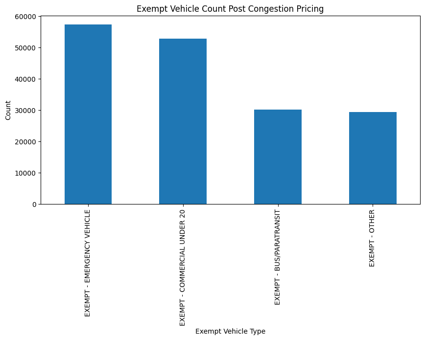
Analysis on Exempt Vehicle Count 🚑 🚒 🚓
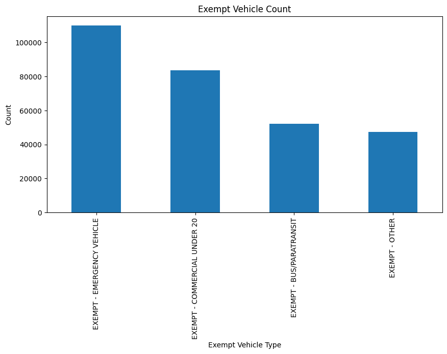
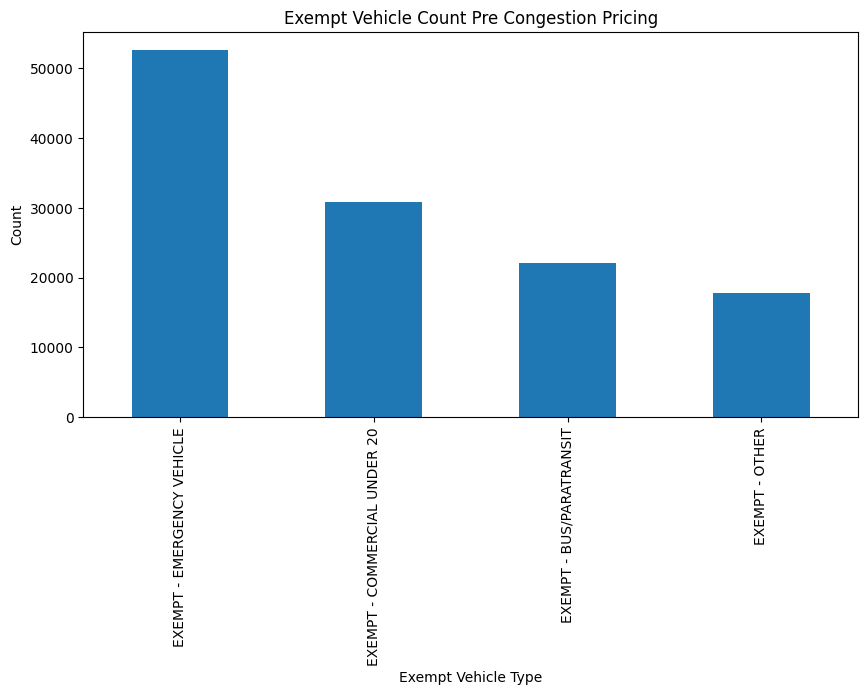
We focused on the ACE violations of exempt vehicles before and after the implementation of congestion pricing. We first separated Manhattan buses from the dataset that contained buses throughout the boroughs which we then found the amount of exempt vehicle violations that has been recorded by ACE. We separated this dataset into two, before the implementation of congestion pricing and after to get a better picture of ACE's role in our bus system.
Key Insights
- Emergency vehicles make up the majority of the exempt vehicle violations. This data includes medical, law enforcement, and fire vehicles.
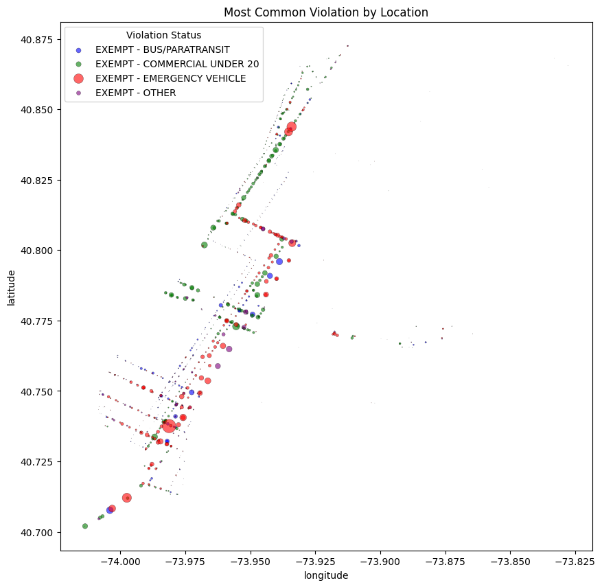
- Using the map, we took note of exempt vehicle violation clusters. For example, there is a dense patch at 2nd Ave, between East 22nd and 23rd street that is made up by emergency vehicles. We conclude that this is likely due to the hospitals in the area.
- We have around 23 months of data before congestion pricing. On average, there is around 5,360 violations from exempt vehicles per month. So far, we have 7 months of data after the implementation of congestion pricing. On average, there is around 24,219 violations from exempt vehicles per month.
- The ratio for the parantransit and "other" exempt vehicles stayed relatively consistent pre and post congestion pricing. While pre-congestion emergency vehicles were far in the lead, post-congestion it was much more similar to a 1:1 ratio for emergency vehicles compared to commercial vehicles, each made up about 1/3 of the occurrences.
Analysis on MTA Bus Speed in CBD 🚌
We compared the bus speeds in Manhattan's CBD zone before and after the implementation of congestion pricing to get an better idea which routes gained speed and which stayed the same. We focused on specific buses that would be traveling in or through the CBD zone to narrow down our dataset.
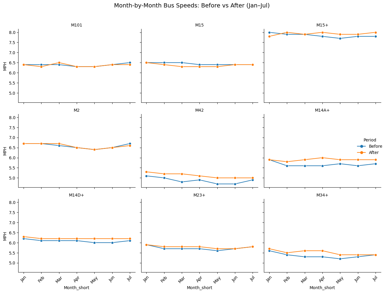
Key Insights
- Most bus routes speed were either maintained or slightly faster after congestion pricing. Bus routes like M101 and M2 stayed relatively similar while M23+, M14+, M23+, and M34+ gained speed, suggesting congestion pricing did not slow buses down.
- M14A+ stands out as it recorded a significant increase in speed compared to before congestion pricing. This suggest that M14A+ routes which runs primarily along 34th Street in Midtown, benefited from reduced east-west traffic congestion.
- After congestion pricing, the difference between the slowest route, M42 and the fastest M14A+ became sharper. Routes that have a strong priority features benefited more while routes without those feaures saw little to no change.
- Congestion pricing on its own isn't enough, with an improvement of stronger bus lanes and better enforcement will ensure all routes not just few will experience smoother and reliable service.
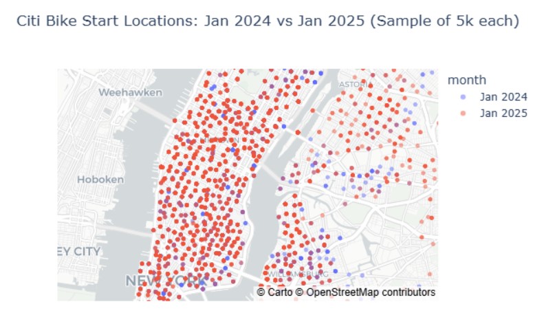
Possible Analysis on CitiBike Ridership 🚴
After examining our datasets, we see CitiBike ridership as an area for future analysis with more data needed for further analysis. We hypothesized that with ACE, bus lanes are overall clearer allowing for faster traffic flow in the CBD zone which makes it more appealing and safer for bikers on the road.
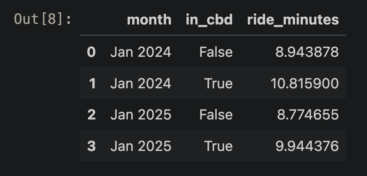
Key Insights
- Comparing the data from January 2024 to January 2025, there is a lot more citibike ridership in CBD zone after congestion pricing
- We compared bike speeds in non-CBD areas and the CBD zone to see the difference within a year. Through this, we see that there is a significant increase from 2024 to 2025 for bike speeds in the CBD zone compared to non-CBD areas.